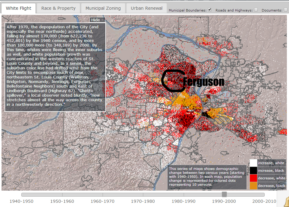
I hope to write a more complete post trying to put the #Ferguson protests in historical relief, but for now I really want to share these maps of white flight in St. Louis. The original maps are from the Mapping Decline project at the University of Iowa Libraries: http://mappingdecline.lib.uiowa.edu/map/. I've added where Ferguson is specifically located in each map.
I'm hoping that with these images you will see the incredible spread of white Missourians away from areas with increasing black populations, usually to the west. Chesterfield, MO, where St. Louis County Chief Jon Belmar resides, is in those western suburbs. The white dots indicate increasing white populations, black dots indicate increasing black populations, red dots indicate decreasing white, and yellow decreasing black.
I'm hoping that with these images you will see the incredible spread of white Missourians away from areas with increasing black populations, usually to the west. Chesterfield, MO, where St. Louis County Chief Jon Belmar resides, is in those western suburbs. The white dots indicate increasing white populations, black dots indicate increasing black populations, red dots indicate decreasing white, and yellow decreasing black.
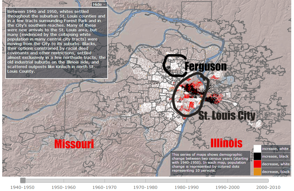
1940-1950
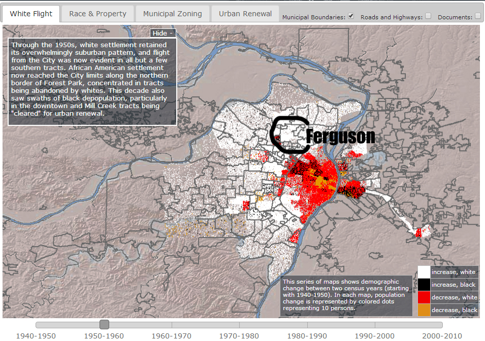
1950-1960 Here you can see an increase in white populations in Ferguson and the rest of St. Louis County accompanied by a decrease in white populations in St. Louis City.
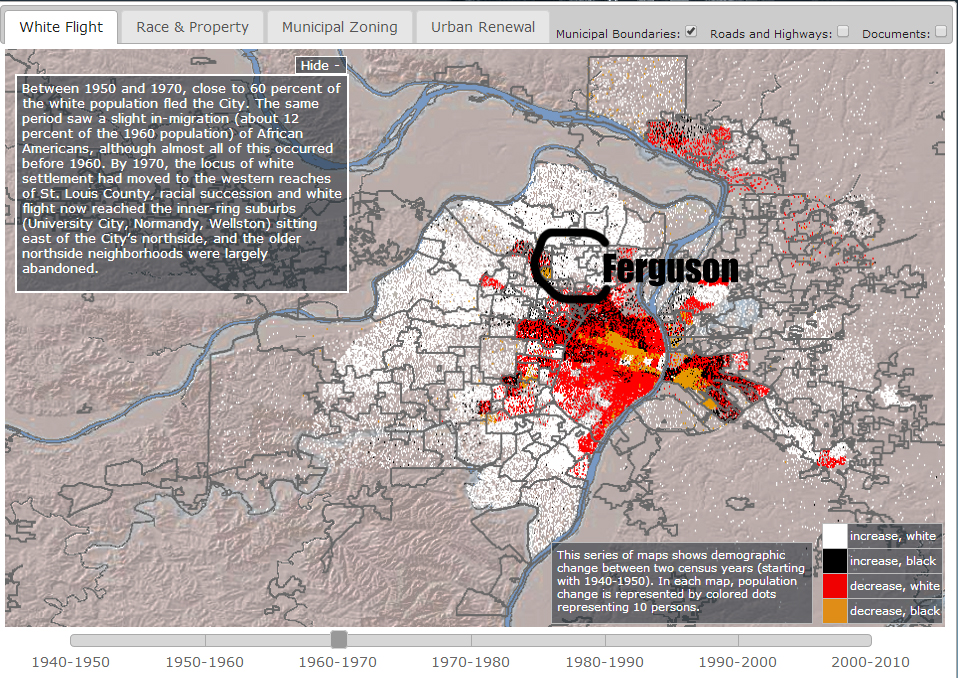
1960-1970 The spread west, south, and north continues
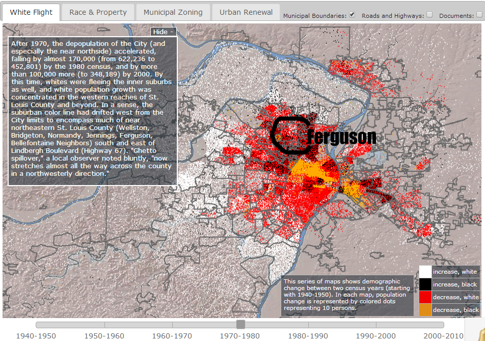
1970-1980 After decades of white growth, the inner ring of St. Louis suburbs begins to see a decrease in white populations.
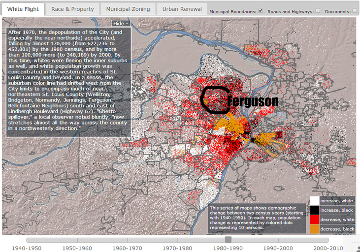
1980-1990 The city of St. Louis itself is depopulating and whites continue to flee the inner suburbs (like Ferguson) and live further and further south and west.
1990-2000 Black families and individuals continue to move out of North St. Louis City and into South City and the northern suburbs.
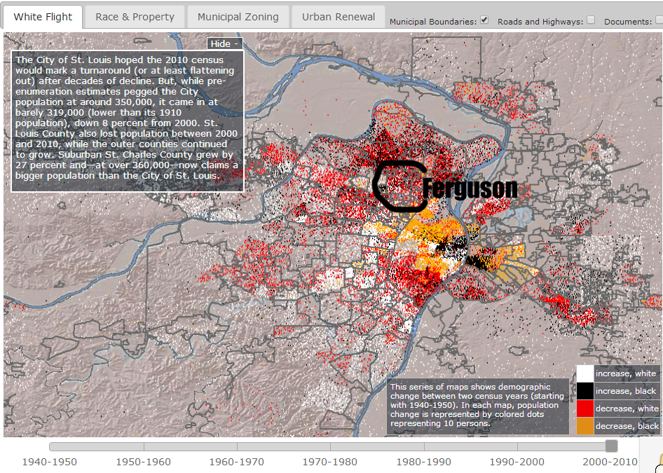
2000-2010 northern St. Louis County continues to attract black individuals and families leaving the city while whites continue their outward growth.
 RSS Feed